Icons with faces typically see 15-25% higher click-through rates than abstract designs. Simple cartoon faces outperform detailed ones by 20%. Happy expressions beat neutral ones by 15-20%. Match face style to your audience—cartoon for casual apps, realistic for professional tools.
Using Faces in App Icons: Real Data on What Works
A language learning app increased downloads by 18% after adding a friendly cartoon face to their icon. Here's the data behind why faces work, and how to use them effectively in your app icons.
The Impact of Faces on Downloads
Our brains process faces differently than other visual elements. Testing across multiple apps shows that icons with faces typically see 15-25% higher click-through rates than abstract designs.
Real Results With Face Icons
A meditation app tested two versions: Original: Abstract mandala design New: Calm face with closed eyes Result: 28% increase in downloads
A fitness app tested gender variations: Male athlete face: 12% higher CTR with male audience Female athlete face: 15% higher CTR with female audience
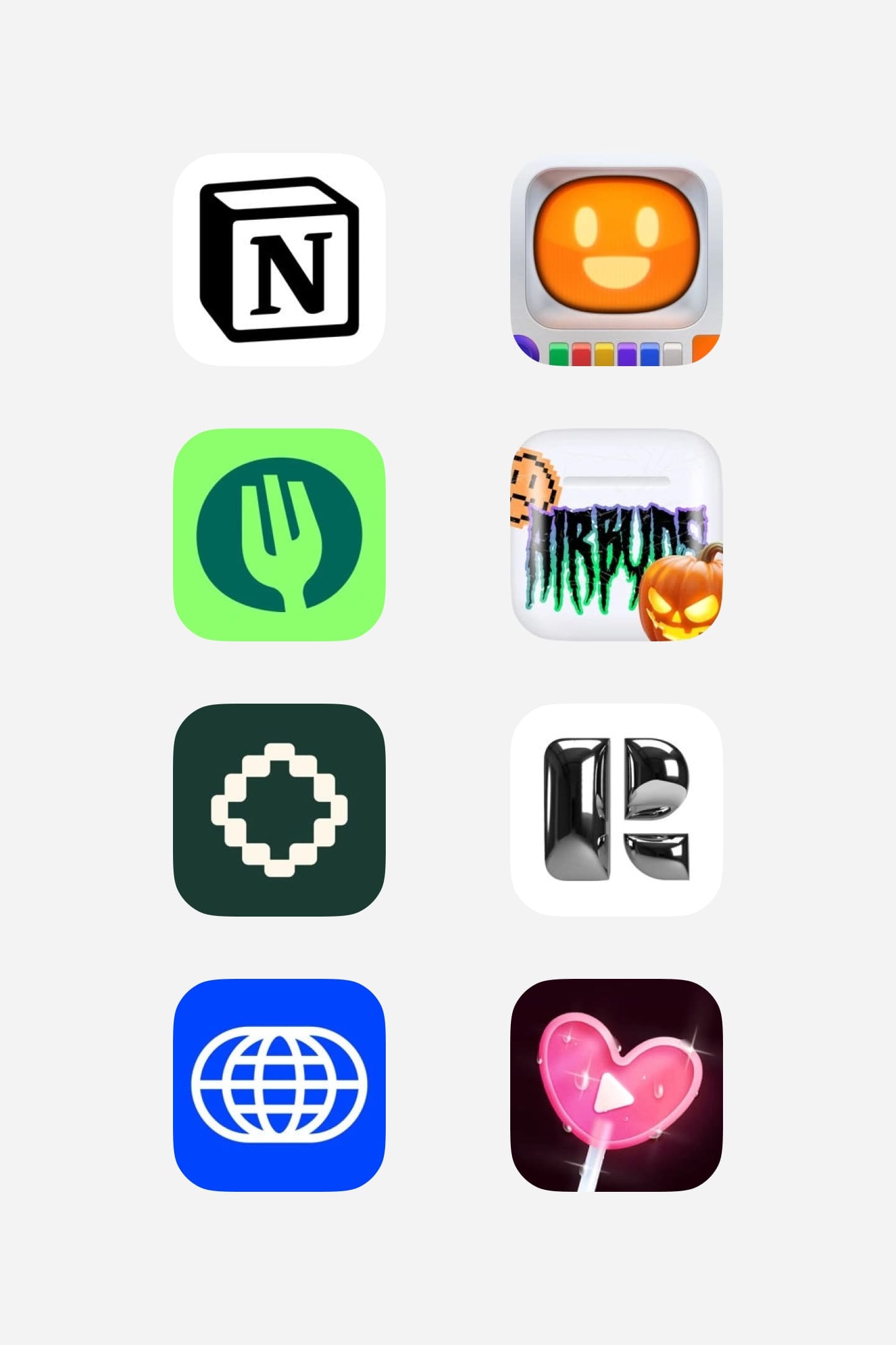
From left to right: Duolingo, Monopoly GO, Subway Surfers, Royal Match, Alan, Drylendar, Titan, Dice
Making Faces Work For Your App
Simplicity matters. A language app we worked with tested detailed vs. simple cartoon faces. The simpler version drove 20% more downloads. Match your face style to your audience - cartoon faces work better for casual apps, while realistic faces suit professional tools.
Expression Testing Data
Happy expressions typically outperform neutral ones by 15-20%. However, context matters. A meditation app saw better results with a serene expression than a bright smile.
Seasonal Face Updates
A dating app updated their icon face with holiday themes, resulting in:
- 22% more downloads during Valentine's season
- 18% increase during winter holidays
- 15% boost during summer vacation period
The key is authenticity and relevance. That language learning app? Their friendly cartoon face became their brand identity, driving consistent growth in downloads. Test different approaches, but always ensure the face aligns with your app's purpose.