
A bold contrasting outline on an icon can increase CTR by 40%. Focus on simplicity with one central element that captures your app's essence. Use color psychology strategically—blue for trust, red for excitement. Track both clicks and retention to avoid attracting the wrong audience. Test one change at a time.
The Complete Guide to App Icon Optimization for CTR
When I first started working on app design, I was surprised by how much an icon could influence downloads. One project taught me this lesson vividly: a subtle tweak to an icon—a bold, contrasting outline—resulted in a 40% jump in click-through rates. That small change made me rethink everything I knew about icon design.
Understanding CTR for App Icons
Your app icon is the face of your product in the App Store. It's your first and often only chance to capture attention. Click-through rate (CTR) measures how effectively your icon converts views into clicks. A higher CTR means more potential downloads without additional marketing spend.
The Psychology Behind Effective Icons
Users make split-second decisions while scrolling through app stores. An effective icon communicates your app's purpose instantly while standing out from competitors. The best icons combine clarity with creativity, making users pause and click.
Core Design Principles
Simplicity First
Complex icons often fail to communicate quickly enough. Focus on one central element that captures your app's essence. A meditation app might use a simple lotus flower, while a photo editor could feature a minimal camera lens. Learn more about minimalist design principles that convert.
Color Strategy
Colors drive emotional responses and recognition. Banking apps often use blue for trust, while gaming apps embrace vibrant reds and purples for excitement. Choose colors that both stand out and align with user expectations for your category. Dive deeper into color psychology for app icons and see which colors drive the most downloads.
Visual Hierarchy
Guide users' eyes to the most important element of your icon. This might mean using contrast, size differences, or strategic placement. Think of it as creating a visual story that can be understood in less than a second.
Testing Your Icon Design
The most successful apps constantly test and refine their icons. Start with your current metrics as a baseline, then test one change at a time. This methodical approach helps identify exactly what drives improvements in your CTR. Learn our complete A/B testing methodology and how to test without breaking your brand.
Measuring Success
Track not just clicks but also conversion rates and user retention. Sometimes an icon that drives clicks might attract the wrong audience, leading to quick uninstalls. Look for balanced metrics that indicate sustainable growth.
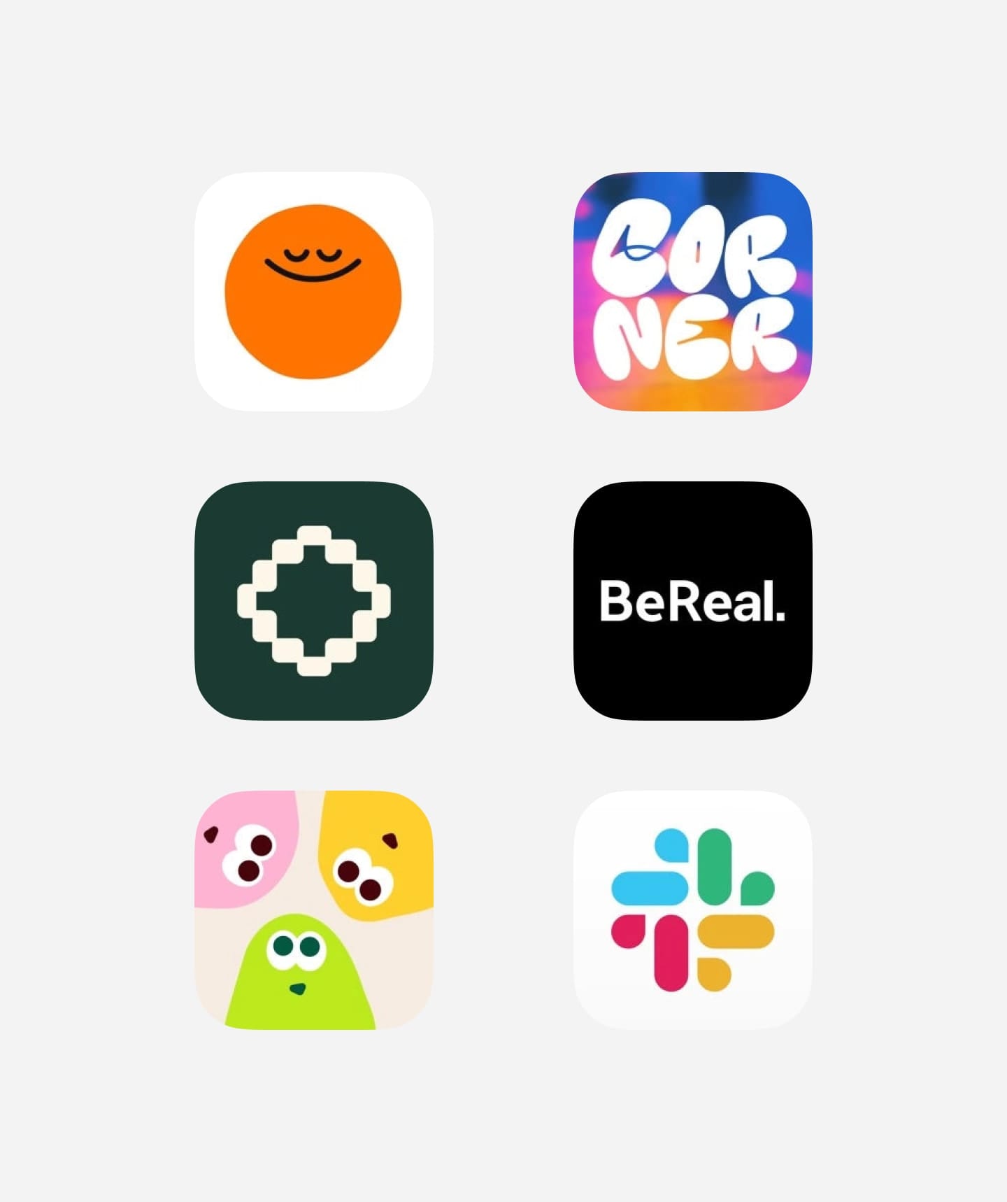
From left to right: Headspace, Corner, Bezel, BeReal, Bimbee, Slack
Common Pitfalls to Avoid
Trend Chasing
While it's important to stay current, blindly following design trends can make your icon blend in rather than stand out. Find the right balance between contemporary design and unique branding.
Platform Ignorance
Different app stores have different visual environments. What works on the App Store might need adjustments for Google Play. Consider how your icon appears in various contexts and platforms.
Tools for Icon Design
Professional designers rely on several key tools for icon creation. Figma offers excellent collaboration features, while Adobe Illustrator provides precise vector control. For beginners, Canva offers an accessible starting point with templates and easy-to-use tools.
Looking Forward
Icon design continues to evolve with new device resolutions and platform guidelines. Stay informed about upcoming changes in iOS and Android requirements, and be ready to adapt your design strategy accordingly.
Remember that financial app I mentioned? Its success came from understanding these principles and applying them thoughtfully. Start with these fundamentals, test consistently, and watch your CTR grow.